bootstrap-モーダル

bootstrap-モーダルをご利用の際には以下の公式オフィシャルを参考にしてください。
bootstrap-モーダルとは?
はじめに、モーダルウィンドウについて簡単に解説します。モーダルウィンドウとは、ボタン・リンクなどをクリックしたときに表示するポップアップ画面のことです。たとえば、次のようなケースで使います。
- 削除ボタンクリック時の確認メッセージ
- 詳細ボタンクリック時に詳細画面をモーダルウィンドウで開くとき
- 画像のポップアップ表示をしたいとき
削除確認画面のモーダルウィンドウ: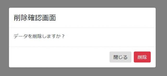
Bootstrapだけで簡単にモーダルウィンドウを開くことができます。開発では良く使いますので覚えておくのがおすすめです!
Bootstrapでモーダルウィンドウを使う方法
次に、Bootstrapでモーダルウィンドウを使う方法を解説します。
モーダルウィンドウの基本的な作り方
まず、モーダルウィンドウの基本的な作り方について解説します。言葉だとわかりづらいので、サンプルコードを用意しました。
サンプルコード:
<!doctype html>
<html lang="ja">

<head>
    <!-- Required meta tags -->
    <meta charset="utf-8">
    <meta name="viewport" content="width=device-width, initial-scale=1, shrink-to-fit=no">

    <!-- Bootstrap CSS -->
    <link rel="stylesheet" href="https://stackpath.bootstrapcdn.com/bootstrap/4.1.3/css/bootstrap.min.css" integrity="sha384-MCw98/SFnGE8fJT3GXwEOngsV7Zt27NXFoaoApmYm81iuXoPkFOJwJ8ERdknLPMO" crossorigin="anonymous">
    <link rel="stylesheet" href="https://use.fontawesome.com/releases/v5.4.2/css/all.css" integrity="sha384-/rXc/GQVaYpyDdyxK+ecHPVYJSN9bmVFBvjA/9eOB+pb3F2w2N6fc5qB9Ew5yIns" crossorigin="anonymous">
</head>

<body>
    <!-- モーダルを開くボタン・リンク -->
    <div class="container">
        <div class="row my-3">
            <h1>モーダルを開く</h1>
        </div>
        <div class="row mb-5">
            <div class="col-2">
                <button type="button" class="btn btn-primary mb-12" data-toggle="modal" data-target="#testModal">ボタンで開く</button>
            </div>
            <div class="col-2">
                <a class="btn btn-primary" data-toggle="modal" data-target="#testModal">リンクボタンで開く</a>
            </div>
        </div>
    </div>

    <!-- ボタン・リンククリック後に表示される画面の内容 -->
    <div class="modal fade" id="testModal" tabindex="-1" role="dialog" aria-labelledby="basicModal" aria-hidden="true">
        <div class="modal-dialog">
            <div class="modal-content">
                <div class="modal-header">
                    <h4>class="modal-title" id="myModalLabel">削除確認画面</h4></h4>
                </div>
                <div class="modal-body">
                    <label>データを削除しますか?</label>
                </div>
                <div class="modal-footer">
                    <button type="button" class="btn btn-default" data-dismiss="modal">閉じる</button>
                    <button type="button" class="btn btn-danger">削除</button>
                </div>
            </div>
        </div>
    </div>

    <!-- Optional JavaScript -->
    <!-- jQuery first, then Popper.js, then Bootstrap JS -->
    <script src="https://code.jquery.com/jquery-3.3.1.slim.min.js" integrity="sha384-q8i/X+965DzO0rT7abK41JStQIAqVgRVzpbzo5smXKp4YfRvH+8abtTE1Pi6jizo" crossorigin="anonymous"></script>
    <script src="https://cdnjs.cloudflare.com/ajax/libs/popper.js/1.14.3/umd/popper.min.js" integrity="sha384-ZMP7rVo3mIykV+2+9J3UJ46jBk0WLaUAdn689aCwoqbBJiSnjAK/l8WvCWPIPm49" crossorigin="anonymous"></script>
    <script src="https://stackpath.bootstrapcdn.com/bootstrap/4.1.3/js/bootstrap.min.js" integrity="sha384-ChfqqxuZUCnJSK3+MXmPNIyE6ZbWh2IMqE241rYiqJxyMiZ6OW/JmZQ5stwEULTy" crossorigin="anonymous"></script>
</body>

</html>
ボタン・リンククリック後の結果: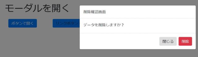
ボタン・リンククリック時にモーダルウィンドウを開くために、以下のようなコードを書いています。
<button type="button" class="btn btn-primary mb-8" data-toggle="modal" data-target="#testModal">ボタンで開く</button>
<a class="btn btn-primary" data-toggle="modal" data-target="#testModal">リンクボタンで開く</a>
「data-toggle=”modal” data-target=”#testModal”」を書くことで、「testModal」というid名のモーダルウィンドウを表示することができます。続けて、クリック後に表示する画面の内容を以下のコードで書いています。
<div class="modal fade" id="testModal" tabindex="-1" role="dialog" aria-labelledby="basicModal" aria-hidden="true">
    <div class="modal-dialog">
        <div class="modal-content">
            <div class="modal-header">
                <h4><div class="modal-title" id="myModalLabel">削除確認画面</div></h4>
            </div>
            <div class="modal-body">
                <label>データを削除しますか?</label>
            </div>
            <div class="modal-footer">
                <button type="button" class="btn btn-default" data-dismiss="modal">閉じる</button>
                <button type="button" class="btn btn-danger">削除</button>
            </div>
        </div>
    </div>
</div>
「<div class=”modal fade” id=”testModal” tabindex=”-1″ role=”dialog” aria-labelledby=”basicModal” aria-hidden=”true”>」とかくことで、クリックしたときに表示するモーダルを指定しています。
divタグ内の「modal-dialog」→「modal-content」以下にあるdivタグで、それぞれヘッダ、内容、フッダーを設定できます。
- 「modal-header」で画面名やタイトルを書くヘッダー部分
- 「modal-body」で詳細な内容を書くボディ部分
- 「modal-footer」でボタンなど置くフッター部分
書き方をすべて覚えようとすると難しく感じるかもしれませんが、上記サンプルコードをモーダルウィンドウを使う型として使い、「id名で指定したモーダルが開けること」「上記3つのdivをかきかえれば表示内容を変えられること」を覚えて変更できるようにしておけばOKです!
背景を目立たせなくする方法
次に、背景を目立たせなくする方法について解説します。クリックするボタンやリンクにbackdropオプションを追加することで、モーダルウィンドウ表示時の背景の明るさ・背景クリック時の動きを変更することができます。
backdropオプションの使い方:data-backdrop="値"値と効果一覧:
- true :背景を目立たなくし、背景クリックでモーダルを閉じる
- false:背景をそのままにし、背景クリックしてもモーダルは閉じない
- static:背景を目立たなくし、背景クリックしてもモーダルは閉じない
先ほどのサンプルに、falseを指定しする場合は以下を変更します。
<!-- 変更前 -->
<button class="btn btn-primary mb-12" type="button" data-toggle="modal" data-target="#testModal">ボタンで開く</button>
<a class="btn btn-primary" data-toggle="modal" data-target="#testModal">リンクボタンで開く</a>

<!-- 変更後 -->
<button class="btn btn-primary mb-12" type="button" data-toggle="modal" data-target="#testModal" data-backdrop="false">ボタンで開く</button>
<a class="btn btn-primary" data-toggle="modal" data-target="#testModal" data-backdrop="false">リンクボタンで開く</a>
クリック後の画面: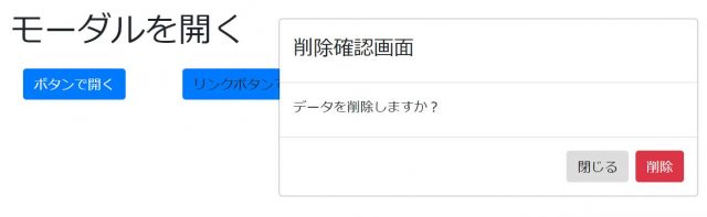
このように、背景の明るさや・背景クリック時の動きを変更することができるので、おぼえておくのがおすすめです!
モーダルウィンドウをさらに使いこなすためのフォームとは?
ここまでのサンプルでは、削除確認メッセージをメインに解説してきましたが、更におすすめな使い方として、モーダルウィンドウを詳細データの入力画面として利用する方法があります。
たとえば、次のような一覧画面の詳細ボタンをクリックしてから、詳細データを入力するようなケースです。
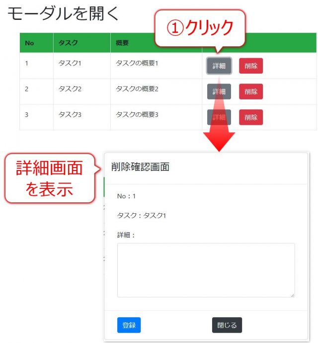
このように、「モーダルウィンドウ + フォーム」を使えばWEBアプリ・WEBサービス開発の幅が広がるので、合わせて覚えておくのがおすすめです!
サンプル1
Modal サンプル数例、Modalへのデータ渡し、Modalからのデータ受け取りも含みます。
サンプル1~8
1)サンプル1: https://liberty.i-revo.com/bootstrap/modal/modal.html
2)サンプル2: hhttps://liberty.i-revo.com/bootstrap/modal/modal02.html
3)サンプル3: https://liberty.i-revo.com/bootstrap/modal/modal01
4)サンプル4: https://liberty.i-revo.com/bootstrap/modal/modal-test.html
5)サンプル5: https://liberty.i-revo.com/bootstrap/modal/modal-test2.html
6)サンプル6: https://liberty.i-revo.com/bootstrap/modal/modal-test3.html
7)サンプル7: https://liberty.i-revo.com/bootstrap/modal/modal-test4
8)サンプル8: https://liberty.i-revo.com/bootstrap/modal/modal-tod-ata
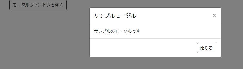
サンプル2
See the Pen bootstrapでモーダルウィンドウを実装する by kabuto64425 (@kabuto64425) on CodePen.
ソースコード
<div id="app" class="container">
<div id="myModal" class="modal fade" tabindex="-1" role="dialog">
<div class="modal-dialog" role="document">
<div class="modal-content">
<div class="modal-header">
<h5 class="modal-title">サンプルモーダル</h5>
<button type="button" class="close" data-dismiss="modal" aria-label="閉じる">
<span aria-hidden="true">×</span>
</button>
</div>
<div class="modal-body">
サンプルのモーダルです
</div>
<div class="modal-footer">
<a class="btn btn-outline-dark" data-dismiss="modal">閉じる</a>
</div>
</div>
</div>
</div>
<div class="row">
<div class="col-12">
<a class="btn btn-outline-dark" data-toggle="modal" data-target="#myModal" href="#">モーダルウィンドウを開く</a>
</div>
</div>
</div>サンプル3
See the Pen [Bootstrap] モーダルの重ね描き by Kusa Mochi (@kusa-mochi) on CodePen.
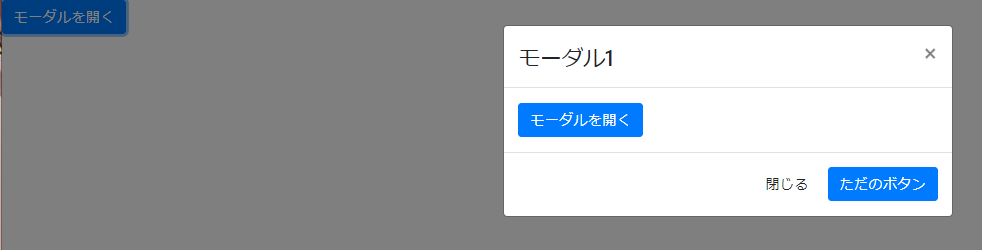
ソースコードHTML
<a data-toggle="modal" data-target="#myModal" href="#myModal" class="btn btn-primary">モーダルを開く</a>

<div class="modal fade" id="myModal">
  <div class="modal-dialog">
    <div class="modal-content">
      <div class="modal-header">
        <h4 class="modal-title">モーダル1</h4>
        <button type="button" class="close" data-dismiss="modal" aria-hidden="true">×</button>
      </div>
      <div class="modal-body">
        <a data-toggle="modal" href="#myModal2" class="btn btn-primary">モーダルを開く</a>
      </div>
      <div class="modal-footer">
        <a href="#" data-dismiss="modal" class="btn">閉じる</a>
        <a href="#" class="btn btn-primary">ただのボタン</a>
      </div>
    </div>
  </div>
</div>
<div class="modal fade" id="myModal2">
  <div class="modal-dialog">
    <div class="modal-content">
      <div class="modal-header">
        <h4 class="modal-title">モーダル2</h4>
        <button type="button" class="close" data-dismiss="modal" aria-hidden="true">×</button>
      </div>
      <div class="modal-body">
        <a data-toggle="modal" href="#myModal3" class="btn btn-primary">モーダルを開く</a>
      </div>
      <div class="modal-footer">
        <a href="#" data-dismiss="modal" class="btn">閉じる</a>
        <a href="#" class="btn btn-primary">ただのボタン</a>
      </div>
    </div>
  </div>
</div>
<div class="modal fade" id="myModal3">
  <div class="modal-dialog">
    <div class="modal-content">
      <div class="modal-header">
        <h4 class="modal-title">モーダル3</h4>
        <button type="button" class="close" data-dismiss="modal" aria-hidden="true">×</button>
      </div>
      <div class="modal-body">
        <a data-toggle="modal" href="#myModal4" class="btn btn-primary">モーダルを開く</a>
      </div>
      <div class="modal-footer">
        <a href="#" data-dismiss="modal" class="btn">閉じる</a>
        <a href="#" class="btn btn-primary">ただのボタン</a>
      </div>
    </div>
  </div>
</div>
<div class="modal fade" id="myModal4">
  <div class="modal-dialog">
    <div class="modal-content">
      <div class="modal-header">
        <h4 class="modal-title">モーダル4</h4>
        <button type="button" class="close" data-dismiss="modal" aria-hidden="true">×</button>
      </div>
      <div class="modal-body">モーダル内のコンテンツ</div>
      <div class="modal-footer">
        <a href="#" data-dismiss="modal" class="btn">閉じる</a>
        <a href="#" class="btn btn-primary">ただのボタン</a>
      </div>
    </div>
  </div>
</div>
ソースコードJS
$(document).ready(function () {
  $(document).on('show.bs.modal', '.modal', e => {
    const $currentModal = $(e.currentTarget);
    var zIndex = 1040 + (10 * $('.modal:visible').length);
    $currentModal.css('z-index', zIndex);
    setTimeout(function() {
      $('.modal-backdrop')
        .not('.modal-stack')
        .css('z-index', zIndex - 1)
        .addClass('modal-stack');
    }, 0);
  });
});
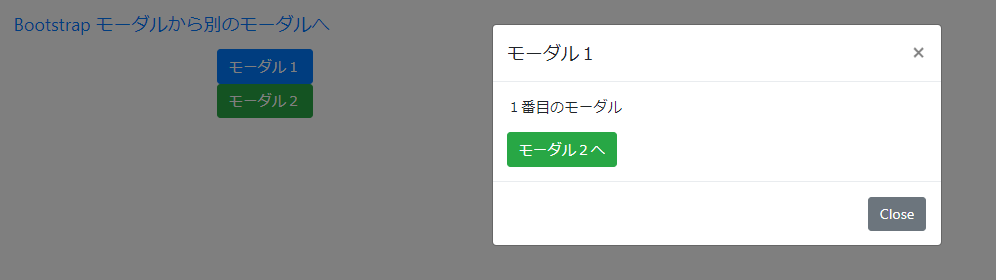
サンプル4
See the Pen Untitled by yu (@yu3205) on CodePen.
ソースコード
<html>
<head>
<meta charset="utf8"/>
<title>Bootstrap モーダルから別のモーダルへ</title>
<script type="text/javascript" src="https://code.jquery.com/jquery-2.0.3.min.js"></script>
<link href="https://maxcdn.bootstrapcdn.com/bootstrap/4.0.0/css/bootstrap.min.css" rel="stylesheet"/>
<script src="https://maxcdn.bootstrapcdn.com/bootstrap/4.0.0/js/bootstrap.min.js"></script>
</head>
<script>
function changeModal(isShowModal){
if (isShowModal) {
$('body').removeClass( 'modal-open' );
$('.modal-backdrop').remove();
$('#exampleModal1').modal( 'hide' );
$('#exampleModal2').modal();
} else {
}
}
</script>
<body>
<nav class="navbar">
<a href="#" class="navbar-brand">Bootstrap モーダルから別のモーダルへ</a>
</nav>
<!-- Button trigger modal -->
<div class="container">
<a href="#" class="btn btn-primary" data-toggle="modal" data-target="#exampleModal1">モーダル1</a><br/>
<a href="#" class="btn btn-success" data-toggle="modal" data-target="#exampleModal2">モーダル2</a>
</div>
<!-- Modal1 -->
<div class="modal fade" id="exampleModal1" tabindex="-1" role="dialog" aria-labelledby="exampleModal1Label" aria-hidden="true">
<div class="modal-dialog" role="document">
<div class="modal-content">
<div class="modal-header">
<h5 class="modal-title" id="exampleModal1Label">モーダル1</h5>
<button type="button" class="close" data-dismiss="modal" aria-label="Close">
<span aria-hidden="true">×</span>
</button>
</div>
<div class="modal-body">
<p>1番目のモーダル</p>
<a href="#" class="btn btn-success" onClick="changeModal(true)">モーダル2へ</a>
</div>
<div class="modal-footer">
<button type="button" class="btn btn-secondary" data-dismiss="modal">Close</button>
</div>
</div>
</div>
</div>
<!-- Modal2 -->
<div class="modal fade" id="exampleModal2" tabindex="-1" role="dialog" aria-labelledby="exampleModal2Label" aria-hidden="true">
<div class="modal-dialog" role="document">
<div class="modal-content">
<div class="modal-header">
<h5 class="modal-title" id="exampleModal2Label">モーダル2</h5>
<button type="button" class="close" data-dismiss="modal" aria-label="Close">
<span aria-hidden="true">×</span>
</button>
</div>
<div class="modal-body">
<p>2番目のモーダル</p>
</div>
<div class="modal-footer">
<button type="button" class="btn btn-secondary" data-dismiss="modal">Close</button>
</div>
</div>
</div>
</div>
</body>
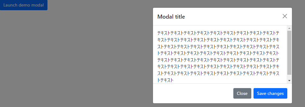
</html>サンプル5
See the Pen bootstrap モーダル内スクロール by kaoru miyamoto (@kaoru-miyamoto) on CodePen.
ソースコード
<!-- Button trigger modal -->
<button type="button" class="btn btn-primary" data-bs-toggle="modal" data-bs-target="#exampleModal">
  Launch demo modal
</button>

<!-- Modal -->
<div class="modal fade" id="exampleModal" tabindex="-1" aria-labelledby="exampleModalLabel" aria-hidden="true">
  <div class="modal-dialog modal-dialog-scrollable">
    <div class="modal-content">
      <div class="modal-header">
        <h5 class="modal-title" id="exampleModalLabel">Modal title</h5>
        <button type="button" class="btn-close" data-bs-dismiss="modal" aria-label="Close"></button>
      </div>
      <div class="modal-body">
        テキストテキストテキストテキストテキストテキストテキストテキストテキストテキストテキストテキストテキストテキストテキストテキストテキストテキストテキストテキストテキストテキストテキストテキストテキストテキストテキストテキストテキストテキストテキストテキストテキストテキストテキストテキストテキストテキストテキストテキストテキストテキストテキストテキストテキストテキストテキストテキストテキストテキストテキストテキストテキストテキストテキストテキストテキストテキストテキストテキストテキストテキストテキストテキストテキストテキスト
      </div>
      <div class="modal-footer">
        <button type="button" class="btn btn-secondary" data-bs-dismiss="modal">Close</button>
        <button type="button" class="btn btn-primary">Save changes</button>
      </div>
    </div>
  </div>
</div>